
Last week I had 3 days to come up with a visualization dashboard. My backend choice was flask (we are inseparable) however I had to choose the easiest plotting package. The choices that I had was between plotly, dash and bokeh. Looking at the bokeh documentation, I found that it was straight forward. However, one of the cons that I had found was: working with categorical data. While all the other packages work seamlessly with categorical data, one has to do some hacks when it comes to bokeh. This made me to look for an alternative. The others were plotly or its dashboard Dash. Now it may seem obvious that one would choose Dash, however I like being in control of the front-end (I am not afraid of going head to head with css, js and html). That is why I decided to go with plotly.
Installing Dependancies
pip install flask
pip install plotly
pip install pandas #will need it to manipulate the data
pip install numpy
Creating the flask application
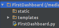
The structure of the application will be as shown below. The static folder will be used to store all the css, js and image files. If you are using any bootstrap template, this is where you will store the files. All the html files will be in the template folder
The python file will have the following initial code.
from flask import Flask

app = Flask(__name__)


@app.route('/')
def index():
    return 'Hello World!'


if __name__ == '__main__':
    app.run()
When you run the file you will have a see Hello World in the url http://localhost:5000/
We will then create a html named index.html and save in the template folder. The file will first have a basic code:
<!DOCTYPE html>
<html>
<head lang="en">
    <meta charset="UTF-8">
    <title>My First Dashboard</title>
</head>
<body>
<div class="container">
    <div class="row">
        <div class="col-md-6">
            <div class="chart" id="bargraph">

            </div>
        </div>
    </div>
</div>
</body>
</html>
We will then change the python file to render the html file. Notice that we had to add render template in the imports.
from flask import Flask, render_template #this has changed

app = Flask(__name__)


@app.route('/')
def index():
    return render_template('index.html') #this has changed


if __name__ == '__main__':
    app.run()
First Plot
We will the plot a bar graph as shown in the plotly. We will create a function that will return the plot. Now this where I fell in love with this package. The simplicity of rendering the plot. However to discover this was not easy. This is why I decided to share this.
First let us import all the dependencies:
import plotly
import plotly.graph_objs as go

import pandas as pd
import numpy as np
import json
The create plot function will have following code. We will create our own sample dataframe, if you have a file you will replace it with the dataframe:
def create_plot():


    N = 40
    x = np.linspace(0, 1, N)
    y = np.random.randn(N)
    df = pd.DataFrame({'x': x, 'y': y}) # creating a sample dataframe


    data = [
        go.Bar(
            x=df['x'], # assign x as the dataframe column 'x'
            y=df['y']
        )
    ]

    graphJSON = json.dumps(data, cls=plotly.utils.PlotlyJSONEncoder)

    return graphJSON
The json variable is what will be rendered on the index function with the html file. This how we will do it:
@app.route('/')
def index():

    bar = create_plot()
    return render_template('index.html', plot=bar)
Now on the html file, we will use the variable to plot. We will have to add the plotly and d3 javascript for the plot to show. The code for plotting a graph using a jinja2 variable is shown below:
<script src="https://cdn.plot.ly/plotly-latest.min.js"></script>
<script src="https://cdnjs.cloudflare.com/ajax/libs/d3/3.5.6/d3.min.js"></script>
<div class="chart" id="bargraph">
    <script>
        var graphs = {{plot | safe}};
        Plotly.plot('bargraph',graphs,{});
    </script>
</div>
Note that the div class has to chart for the plot to show. When you run the python file and reload the page, you should see a bar graph:
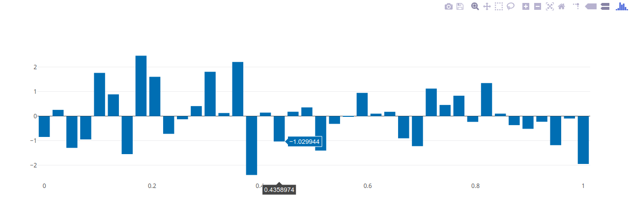
Congratulation! You have added a plot on a html. This is the basics. we can go ahead and style it. I will not cover that in this blog. What I would like to finish with is adding ajax calls.
Creating plot with ajax calls
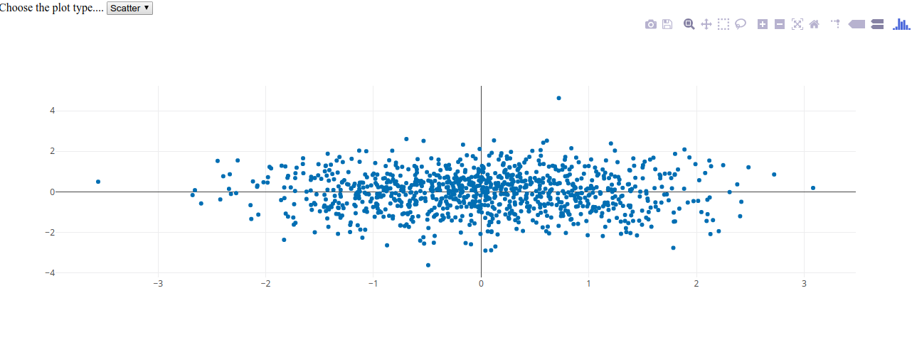
It took sometime for me to be able to figure this out. Plotly.js to the rescue. Lets add a dropdown that we will use to change the type of plot.
<div class="col-xs-3">
    <label> Choose the plot type....</label>
    <select class="form-control" id ='first_cat'>
        <option value="Bar">Bar</option>
        <option value="Scatter">Scatter</option>
    </select>
</div>
Now lets create a javascript called plots.js that will have the ajax function on change. We will return the json variable of the plot.
$('#first_cat').on('change',function(){

    $.ajax({
        url: "/bar",
        type: "GET",
        contentType: 'application/json;charset=UTF-8',
        data: {
            'selected': document.getElementById('first_cat').value

        },
        dataType:"json",
        success: function (data) {
            Plotly.newPlot('bargraph', data );
        }
    });
})
The ajax function will take the selected variable from the dropdown and pass it to a function in flask, with a route /bar then it will return the plot. The code on the flask end is as follows:
@app.route('/bar', methods=['GET', 'POST'])
def change_features():

    feature = request.args['selected']
    graphJSON= create_plot(feature)

    return graphJSON
I had to edit the create plot function so as to accommodate the selection of the plots. The new code is as follows:
def create_plot(feature):
    if feature == 'Bar':
        N = 40
        x = np.linspace(0, 1, N)
        y = np.random.randn(N)
        df = pd.DataFrame({'x': x, 'y': y}) # creating a sample dataframe
        data = [
            go.Bar(
                x=df['x'], # assign x as the dataframe column 'x'
                y=df['y']
            )
        ]
    else:
        N = 1000
        random_x = np.random.randn(N)
        random_y = np.random.randn(N)

        # Create a trace
        data = [go.Scatter(
            x = random_x,
            y = random_y,
            mode = 'markers'
        )]


    graphJSON = json.dumps(data, cls=plotly.utils.PlotlyJSONEncoder)

    return graphJSON
Do not forget to add jquery javascript to your index.html and the plot.js
<script src="{{ url_for('static', filename='js/jquery-1.11.1.min.js') }}"></script>
<script src="{{ url_for('static', filename='js/plots.js') }}"></script>
With those changes, we can run our python file again. When we select the scatter plot option, you should be able to see the plot.:
With that you can get going with creating dashboards.
Full code can be found on this link
Hello, Can you please share the full code with me? Thank you
Hello,
https://github.com/yvonnegitau/flask-Dashboard . You will find the code there.
Plotly.newPlot(‘bargraph’, data )
You might want to change the id name to something generic since it is no more only ‘bargraph’
Also,
Many thanks for the tutorial.
Thanks a lot for this tutorial.
Straight-forward, useful and fairly complete.
I wonder how to style it?
You can style the page using normal css code. As for the graphs, check some of parameters of the graphs. You can alter color, line style, markers. Its similar to matplotlib.
when i run with Ajax calls with ‘/bar’ extension it is showing 400 Bad Request
Hello,
Make sure you have contentType and dataType on your ajax call
Hello, How can i display two graphs without any select condition using the ajax calls it self?
Is this possible?
Hello,
Yes it is. Place them on two different . The code syntax will be the same as is on index.html . What changes will be the name variables.
Please share the snippet if you have succeeded in plotting the graphs.
How can I show 3 plots on a select condition ? using elif in create_plot()
Hello,
Yes using elif on create_plot().
When i am running it , it show me like that only >
graph-0
graph-1
graph-2
Whats the wrong ?
Thanks
put name = ‘something’ in each trace
Just fantastic that sometimes you’re wondering whether something is possible, and then stumble upon such a perfect tutorial. Thanks!!
Please your help.
could you please give me example of how can we style it. I have tried but with success.
Thanks in advance.
Great Tutorial.
How would you update/add layout to the chart?
This is great, exactly what i was looking for. I’m working with dash but with this i can use plotly in personal hobby websites as well. Thanks for sharing!
Great tutorial! I’d recently started using Flask for a personal website (after having used dash for a bit), and i felt using the html templates was way easier than using the html function/class in dash (not sure which it is).
Have you tried to or had any success getting callbacks from the charts (example, data from a point you clicked on)?
This is great article! I recently started using Flask for a personal website, and I found I much prefer jinga templates to the plotly html library and was thinking about this exact thing.
One question, have you been able to get dash style callback data from the chart? Example, x/y/name data on click?
Did you get success in callbacks?
Hello, thought it was interactive, why not?
I am getting empty plot. i m plotting a normal pie plot using plotly and passing the plot in variable to html
Nice one, thank you.
I think you aren’t using HTTP POST requests here though, you don’t need the `methods=[‘GET’, ‘POST’]`, “selected” is just a request parameter here, passed as `/bar?selected=’Bar’`.
Hey can you tell me how to add chart labels ….
you can email me at [email protected].
Tanks so much!!
It was so useful and important to me.
You made a wonderful work.
Congratulations!!
Incredible tutorial, it worked straight out of the box!!
Great!
thanks for the helpful tutorial
awesome ! exactly what I was looking for … for long time!
thank you to share with us this tutorial , and present how plotly can be “unblocked” from flask ! very valuable …
appreciated your work.
Hello i am new user and i would to ask you, How to disable a pm?
Thanks so much for this! It was very straightforward and exactly what I need to get started using plotly and Flask.
Thanks so useful!!
Ms. Wambui –
Thank you for taking the time to put this post together.
I’m writing this 30 months after you posted it and as you can tell from all the comments, it’s still very helpful – especially for us Python/Flask newbies.
Tom