Hepta Analytics Blog

Hepta Analytics Blog

Stories about going beyond information.

Skip to content
Menu
  • Blog
  • Website

Tag: Visualization

Big Data

Using Datamaps for animating maps over time

Posted on November 20, 2018November 25, 2018 by Yvonne Wambui

The past week the data team was tasked with visualizing map statistics over a map. This seems easy for anyone who has used D3.js, but…

Big Data

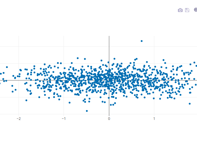
Flask + Plotly Dashboard

Posted on August 7, 2018October 30, 2018 by Yvonne Wambui

Last week I had 3 days to come up with a visualization dashboard. My backend choice was flask (we are inseparable) however I had to…

Recent Posts

  • Hepta Analytics Microsoft Silver Partner
  • Lessons Gleaned from Attending and Speaking at the World Economic Forum for Africa 2019 Gathering
  • 2019 in Review
  • Financial Payments: Catalyst for Growth in Africa
  • Animated Bar Graphs

Recent Comments

  • unknown on Flask + Plotly Dashboard
  • Jefferson Dietrich on Hepta Analytics Microsoft Silver Partner
  • bellevag on Flask + Plotly Dashboard
  • Raf on Flask + Plotly Dashboard
  • simon on Flask + Plotly Dashboard

Archives

  • January 2021
  • April 2020
  • December 2019
  • November 2019
  • June 2019
  • May 2019
  • April 2019
  • March 2019
  • February 2019
  • January 2019
  • December 2018
  • November 2018
  • October 2018
  • September 2018
  • August 2018
  • July 2018
  • June 2018
  • May 2018
  • April 2018
  • March 2018
  • February 2018

Categories

  • Big Data
  • Cloud Computing
  • DevOps
  • Digital Transformation
  • Geospatial
  • Impact
  • Infrastructure
  • Kubernetes
  • Machine Learning
  • Microservice Architecture
  • Migration
  • News
  • Policy
  • Security
  • Software Engineering
  • Technology

Meta

  • Log in
  • Entries feed
  • Comments feed
  • WordPress.org
© Copyright 2021 – Hepta Analytics Blog
Wisteria Theme by WPFriendship ⋅ Powered by WordPress